Color is more than a visual element—it is emotion, atmosphere, and expression woven into every brushstroke. In wildlife art, the choice of color shapes the mood of a piece, guiding the viewer’s experience and deepening the connection between subject and setting.
Each hue carries its own weight. The warmth of autumn golds, the cool serenity of winter blues, the vibrancy of spring greens—all evoke different feelings, different narratives. A painting bathed in soft, muted tones may convey quiet reflection, while bold, contrasting colors can create energy and movement.
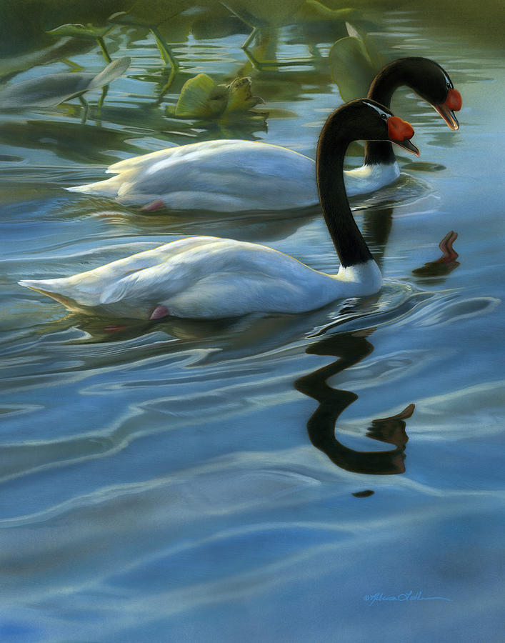
In my work, I am drawn to the way color interacts with nature. The rich siennas of a sunlit prairie, the deep shadows of a forest, the icy whites of a frozen river—each palette is carefully chosen to reflect the essence of the scene. The colors are not just about realism; they are about emotion, about capturing the feeling of being there, of witnessing the moment firsthand.
Beyond individual hues, the way colors blend and contrast plays a vital role. The subtle transition between warm and cool tones can create depth, while the interplay of light and shadow adds dimension. Even the smallest shift in color temperature can change the entire mood of a painting, altering how the viewer perceives the subject.
Ultimately, color is a language—one that speaks to the soul of a painting, shaping its impact and resonance. Through careful selection and layering, I strive to ensure that each piece carries the same depth and emotion that I experienced in the wild. Because in the end, wildlife art is not just about form—it is about feeling, memory, and the quiet beauty of nature’s palette.